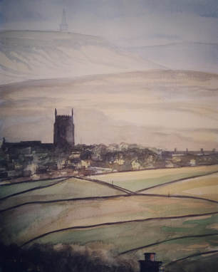
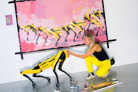
 Pilat with Basia Pilat with Basia I’ve just finished reading about a Polish artist called Agnieska Pilat, living in New York, who uses a robot dog to draw abstract images on canvas. Her dog, Basia, has its own social media following and sells to a growing number of collectors. Pilat is described as a Silicon Valley Artist. However mad it sounds, it’s just the latest example of an artist using technology as a tool to create their art. It has always been the case. They say that ideas are the ‘mother of invention’ – well so too are tools. They allow the artist to realise their vision, either by making it easier to produce or by introducing a different style. A mundane idea can be transformed by technology. Take David Hockney and his famous iPad paintings. Hockney has always embraced the new, from fax machine prints to photo collage. When digital painting apps first appeared, he was a pioneer in their use. Whether you are a fan or not, his enthusiasm is clear and he has been prolific in the use of digital painting, especially in the recent lockdown when he produced a series of seasonal paintings based at his home in Provence. They are all vividly coloured and loosely applied with chunky strokes that look clean and fresh. Some of these iPad paintings can be seen in a new exhibition at the Fitzwilliam Museum in Cambridge called ‘Hockney’s Eye’. The exhibition takes its theme from a book and tv show from the 1990s, ‘Secret Knowledge’, in which he establishes that great artists of the past utilized lenses, and in particular, camera obscura, to capture the initial composition before painting a scene in the studio. Personally, I don’t view this as controversial, but there are many artists, and non-artists, who view the use of lenses, for projecting or capturing an image, as cheating. 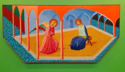 Annunciation II by David Hockney (after Fra Angelico) Annunciation II by David Hockney (after Fra Angelico) Canaletto broke down his complex Venetian vistas into a series of camera obscura tracings, before compositing them into a single scene for painting. Similarly, Vermeer ensured accurate perspective in his simple domestic settings using lenses before committing to paint. Why should we think any less of them as artists? No skill has been lost in the quest for accuracy as the translation of image to sketch involves just as many decisions about which marks to include or omit. The painting process itself still forms the backbone of the artwork. Hockney’s Eye takes subjects, such as perspective and optical aids, and discusses them through the use of diagrams, film or models alongside works by Hockney and old masters from the Fitzwilliam collection (though there are notable loans such as ‘The Avenue at Middelharnis’ by Hobbema). 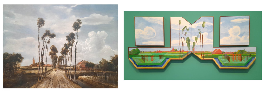 The Avenue at Middelharnis by Meindert Hobbema and After Hobbema (Useful Knowledge) by David Hockney Though an interesting and informative display, Hockney’s work ultimately falls short when shown alongside classical paintings. His ideas are novel and his play with colours and perspective exciting, but these are not his best pieces and look clumsy in comparison (his portraits, perhaps, being the exception). Overall, though, the exhibition is worth a look at. It might make you see well known paintings through fresh eyes and even convince you that ‘copying’ from a photo isn’t such a bad thing after all! Hockney’s Eye, Fitzwilliam Museum, Cambridge till 29th August 2022.
10 Comments
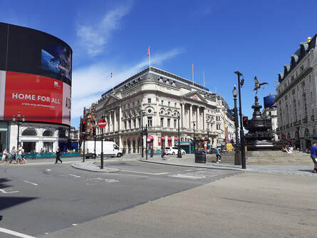 However much I tried to ignore it, it was inevitable that the dreaded C word would make its way into one of my blogs. There is no need to document all that has happened since Covid’s arrival back in March – we have lived every moment in minute detail in the daily news updates. September though, seems to offer a glimmer of hope and good things are on the horizon that reek of normality…so I’m optimistic, for now! My barometer of normality is how visitor attractions are coping and it was nice to visit a cross section of galleries and museums across the country in the past weeks. London is only 30 mins away on the train, but it couldn’t have felt further away over the past 5 months. In August though, the National Gallery reopened its doors and that was the excuse for me to return for a gander. Though the West End wasn’t as empty as earlier months, it was still amazing to wander through Leicester Square and Piccadilly without dodging and weaving through hoards of tourists. Though it is obviously worrying for the local businesses, it was on the other hand, quite a relaxing and pleasant experience for the visitor! 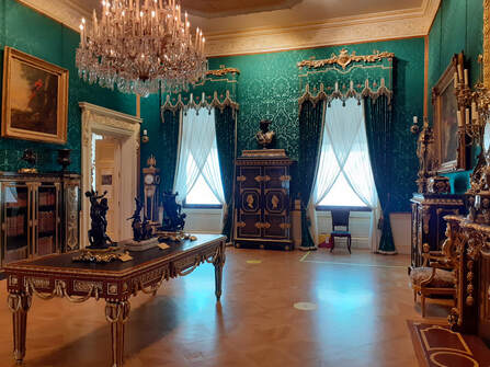 Booking online is almost as mandatory as the wearing of masks for any attraction nowadays, and so whilst having my morning coffee, I decided to book a spot at The Wallace Collection in Manchester Square. It houses a fantastic collection of artworks and armour within an 18th century mansion setting, and once through the door, it almost felt like I had the place to myself. Sure, there was a route I had to follow and there were plenty of staff, but I didn’t have to jostle for space and I could take in a whole room at my own pace. It’s a gem of a museum/ gallery within a stone’s throw of Oxford Street. In contrast, the National, being a larger institution, caused a tad more anxiety. Though a time slot had been booked, I entered as a large group, single file, with visitors getting a little close for comfort in their eagerness to get in. I’ve been to the National many times, and so the novelty was in following a prescribed route through familiar rooms and having, once again, less people to view them with. In the main, visitors behaved themselves and tried not to crowd around the more famous pieces, and here and there an attendant would hold people back to allow others to view and pass on. My highlight was the chance to be alone with Leonardo’s ‘Madonna of the Rocks’ if only for a few minutes. 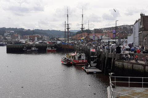 As relaxed and enjoyable an experience as my trip to London was, I understand this is not normal. Our Capital should be buzzing and busy and visitors should be flocking to the latest blockbuster exhibitions and performances. Less visitors means less income for the attractions and in turn less budget for the exhibits that draw and entertain those crowds, and for the staff behind the scenes who run the show. A couple of weeks ago, I visited Whitby, in North Yorkshire, with my family. We had a similar experience at Whitby Museum as I’d had in the Wallace Collection – not many visitors and a relaxed experience. However, when we descended into the town itself, it couldn’t have been more different. Huge crowds of tourists squeezing down the narrow streets and pouring into the restaurants. It would be unpleasant on any ordinary holiday, but with our current climate, we had to clamp on our masks and (after a quick takeaway lunch) get out fast. I guess that the lack of foreign holidays was a factor. I also think that, due to local attractions requiring booking and with limited spaces available, many visitors had found themselves turning up in the area with few places to go. 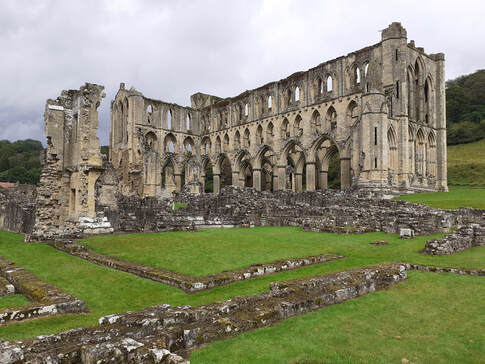 The day after, in pouring rain, we spent a relaxed, if very wet, time wandering round the ruins of Rievaulx Abbey, having booked our slot a few days before. Again, it was great to have bits of the abbey to ourselves as it added to the atmosphere, but there should have been a lot more visitors, and I’m sure English Heritage, as a charity, will suffer for it.
So, what’s the moral of the story? Well, think before you take a trip. Don’t plump for the obvious places, seek out the smaller venues and out of the way spots. Do your research and book in advance. Attractions are beginning to open up, so unless you are vulnerable or at risk, there is no excuse to stay at home. Put on your masks and get out there and visit our museums and galleries, watch films in a cinema and with any luck, prepare to see actors live on stage again. Use them or we'll lose them. 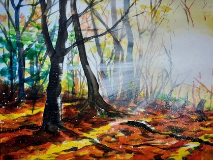 'Mardley Woods', acrylic on paper 'Mardley Woods', acrylic on paper After all the doom and gloom of a spectacularly wet winter, there has been a burst of life in the garden as the spring flowers have suddenly started to bloom. It just proves that there is always hope, no matter how bad things appear. I’m currently thinking about the direction of my personal artwork and mulling over possible projects for the coming year, including the continuation of previous ideas. Thankfully, I don’t have artist’s block, but there is always a nagging doubt about the validity of an idea – and then the sun shines on the primroses and I realise that ideas don’t have to be complex and have huge meaning. It can be as simple as a flower caught in the sunlight. 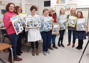 Art of the Landscape alumni 2020 Art of the Landscape alumni 2020 My artist’s block has also been curtailed by my weekly tutoring at The Letchworth Settlement and art group demonstrations held so far this year. Having to paint to a deadline, or a specific time of day, forces you to think on your feet, economise your paint strokes and talk about your method whether you feel like it, or not. I liken demonstrating or tutoring to being on stage as an actor, or presenter. It doesn’t matter what is going on in your life – for that moment, in that place, you are performing to the best of your ability, to help and inform others who have taken time out (and money) to be entertained or taught by you. It’s like a bubble of time, separate to the world outside, for 2 ½ hours (with tea and biscuits included). This week I gave my ‘acrylic ‘class’ students a short item called ‘5 things you need to know about acrylics’ – a few facts and pieces of advice acquired over the years with the intention of de-mystifying acrylic paint. Some people avoid using acrylics because they think they are ‘difficult’, but really, compared to watercolour and oils, they are more versatile and forgiving (with practice). I thought I’d share that advice on my blog, just in case you fancied having a go yourself! 5 Things you need to know about ACRYLICS: 1. Acrylics are a water soluble medium – all you need to start painting is acrylic paint, something to paint on (usually canvas or paper), brushes and water. Along the way, you can buy fancy equipment, various mediums to add to the paint, stay wet palettes, etc. However, if you want to explore acrylic paints you can start off very simply – just as you can with watercolour paints. That way you can begin to appreciate how the acrylics behave as a medium – how they mix, how they dry and so on. 2. Acrylics are non- toxic – unlike the use of oil paints, for instance, which need solvents to thin them down. Those solvents, usually turpentine, can cause irritation to the skin and sore throats. As I say, you only need water to paint with acrylics, However, to make acrylics even more versatile, various mediums have been created to add to the paint. Essentially, acrylic paints are a colour pigment held in a polymer binder – polymer being a form of plastic. So, they can be thinned down and painted with – but once they are dry they are water resistant and become plasticised – like a flexible membrane. This is great, because the paintings do not need to sit behind glass or be varnished to protect them (though you may want to do that for an effect). Technically, they should last forever, and as long as you keep them out of strong sunlight and use decent quality paints, they should never fade. 3. You can paint on anything – originally acrylic paints were developed for painting interior and exterior walls, and because it is plastic and flexible when dry it can attach itself to pretty much anything. I remember a guy at school painting record cover artwork on leather jackets for pocket money! For the artist, it usually means painting on canvas or paper, but use your imagination – it could be used as a sculptural form in itself! Really, the only thing that dictates what is a good support is how long the substrate you’ve painted on will last, and how good the bond is between the paint and the substrate. So, for instance, if you paint on glass, and it’s constantly heating up or getting knocked, the paint may start to peel off as it’s a very smooth, non- porous material. If it’s paper, the pigment is absorbed and so the painting will last as long as the paper does, if kept well. Basically, the acrylic paint will probably outlast the material it is painted on! 4. Acrylic dries quickly – Some people see this as a negative point, but to me that’s what attracted me to the medium in the first place. You can produce a quite complex painting, using all sorts of techniques of brushwork, that will be dry and portable in a couple of hours. With oil paints you’ll be waiting hours for each layer and it will take 6 months for the finished painting to fully cure. I just don’t have the patience! That said, you’ve got to be careful. Only use the amount that you need – little and often – or keep spraying the paints with a spray gun to keep them moist. You can also use so-called ‘stay wet’ palettes (which have a layer of moist blotting paper covered with a ‘baking parchment’- type paper within a tray) which keep your paints wet for longer but can become mouldy. Also, watch your brushes. Don’t leave them to dry out with paint still on them, or you’ll never get them clean again. Keep rinsing them – but don’t leave them in the pot either. Just dry them flat. If you need to get some stubborn paint out do it soon as you can with liquid soap and water. You can also add mediums, such as retarder or flow improver that essentially extend the drying time – keeping them wet for longer; allowing you to spread the colours further or make the paint bulkier. 5. Quality means quantity …of pigment! As in all paints, you get what you pay for. However, the quality of acrylics is largely down to the quantity or strength of pigment within the binder – for instance, a Titanium white acrylic from a certain cheaper home store, will be thinner and more translucent than an equivalent from Daler Rowney. I don’t see that as a problem, though, if you know about it. I mix and match different brands to give different results. The thinner white paint is great as an underlayer for skies, or for using as a mixing white to bind other colours. It’s worth just trying them out – they may be for you. At least cheaper brands give you a foothold in the medium and once you become more confident you can splash out a bit more on materials. 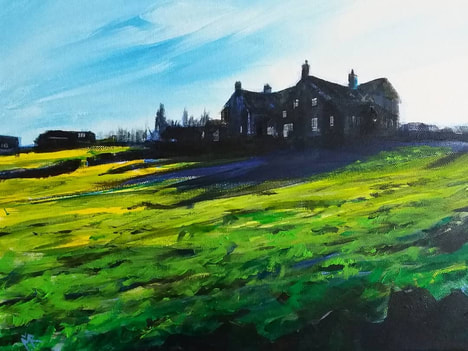 'Pinner Fields', acrylic on canvas Spring has most definitely sprung. After months of inactivity, my garden has suddenly burst in to life with a full- on display of loveliness and life. It’s a beautiful time of the year and it’s hard to keep up with all the changes – and inevitably, the weeds! Similarly, the art year is beginning to kick off. In the summer I’ll be taking part in a few major events and I really need to start organising them now. What artworks do I need to take? How many more do I need to paint? Which ones do I produce prints of? What shirts do I wear? That kind of thing. A million different questions and, well, I can feel a spreadsheet coming on. 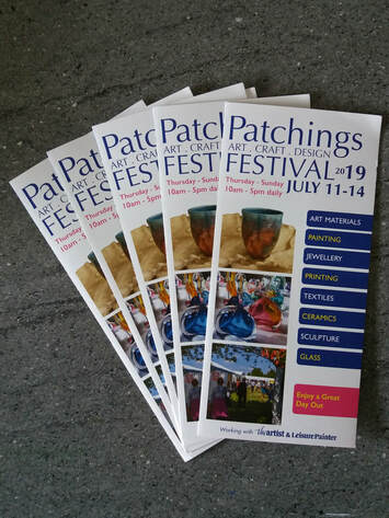 First up will be the Patchings Festival at the Patchings Art Centre in Nottinghamshire (11th – 12th July) patchingsartcentre Though I’ve had my work on display twice at the Art Centre as part of ‘The Artist’ competition, this will be my first event as a participant. I’ll have my own mini studio nestled amongst a marquee full of fellow artists and art materials suppliers, where I’ll be demonstrating and selling my wares. I’ll also be camping, so any tips on looking fresh in the morning would be welcome! I’m looking forward to the experience, but I must admit that I’m a little daunted! He who dares, and all that. 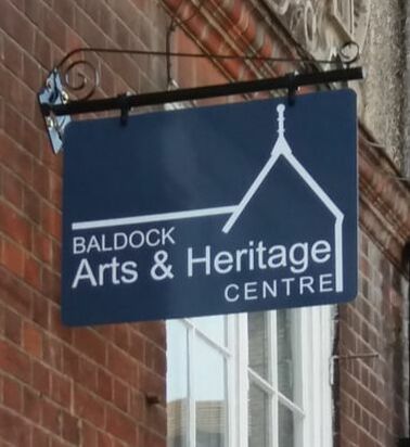 Then in September, if I have any paintings left (!) I’m once again taking part in the Herts Open Studios (7th–29th September). hvaf.org.uk I’ll be returning to the Baldock Arts and Heritage Centre but this time as one of four artists – the Baldock 4! I’ll be joining textile artist, Lucy Sugden, abstract painter, Paul Hillary, and sculptor, Dawn Dominic, in the newly refurbished Old Town Hall. We’ll be demonstrating and holding workshops as well as exhibiting, so it promises to be an exciting event!  In an extreme case of being ready well in advance, I’ve submitted another article for ‘Leisure Painter’ magazine which will be featured in the February 2020 issue. It is a ‘step by step’ account of how to paint a winter farm scene, which was an interesting one to write on a hot April day!
In the meantime, I continue to run my regular ‘Art of the Landscape’ class at the Letchworth Settlement letchworthsettlement We’ve just begun another 10 week course which will take the theme of ‘British Landscapes’, producing scenes in a variety of mediums – from stone circles to castles, mountains to streams, Constable to Lowry it promises to be a fun summer term! For those people who can’t make a Friday morning, towards the end of the year I will be holding a similar class on a Thursday evening, as well as my shorter Acrylic painting classes. Details will follow later in the year. 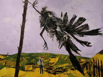 Bryan Kneale, Rook in the Wind, 1954 Bryan Kneale, Rook in the Wind, 1954 January is now halfway through and the first big art show of the year began yesterday at the Business Design Centre in Islington – the London Art Fair. I’ve been going to this event for several years now and I have to say that it is a little like Groundhog Day, in that not a lot seems to change. One would think that the galleries would refresh their displays each year with up and coming artists; perhaps get their established artists to produce some new works and do something different. I’m looking for excitement, I’m looking for spectacle – I’m looking for something that you wouldn’t normally get if you visited the galleries ‘at home’. It’s a big space with an opportunity for scale, or theatricality. It sells itself as a fair for contemporary and modern art, but there are no contemporary public galleries here, no chance to see up and coming students or bright young things. The emphasis is on sales and high-end bling – not on showcasing the future and testing the waters for who might be hot in years to come. Don’t get me wrong, there’s plenty to see there, but most interesting pieces seemed to hover around the early 20th century, with work by Lowry, Spencer, Hepworth and the odd expensive scribble by Picasso. A stand out piece was Bryan Kneale's Rook in the Wind, Isle of Man, once owned by Sir Richard Attenborough. It looked like a pictoral version of a Ted Hughes poem, all feather, sinew and claw. 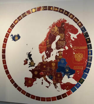 Yanko Tihov, Europe 2019 Yanko Tihov, Europe 2019 Elsewhere, there was plenty of figurative work and sculpture, but not much in the way of landscape. Gimmicks were abundant with weird materials, close- ups, photoshopped images, repeated shapes – mostly great as pieces of interior design, but not as mirrors of the artists’ personalities. There was a distinct lack of social commentary, for instance, with the exceptions being Pourquoi II, a macabre painting of three Holocaust victims, by John Bellany RA, and an interesting mural, Europe 2019, depicting Europe with all its former passport covers, by Yanko Tihov. As I’ve said, the London Art Fair is really about a certain cross- section of galleries, signing up for the same stands each year and selling the same wares. That’s fair enough, but on a personal level I need to get out and see some of the other big shows to get a better perspective on the art market. I don’t think I’ll visit LAF for another three years at least, which is hopefully enough time for the content to reboot. 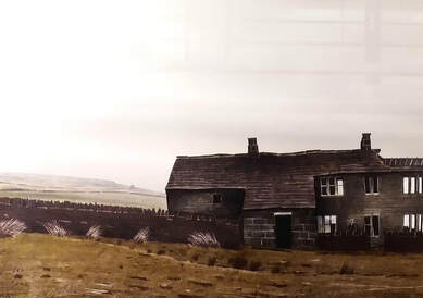 Peter Brook, September, 1978 Peter Brook, September, 1978 Highlights included a great wall full of Peter Brook prints showing the South Pennines throughout the year which were beautifully done and reminded me of where I grew up. 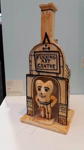 Grayson Perry, Fucking Arts Centre, 2016 Grayson Perry, Fucking Arts Centre, 2016 There was also a small ceramic by Grayson Perry, produced to raise money for Battersea Arts Centre after a fire. It shows Alan Measles, his teddy bear hero, stood at the entrance with a paint brush penis and large words above him stating, “Fucking Arts Centre”.
It captured my thoughts precisely! 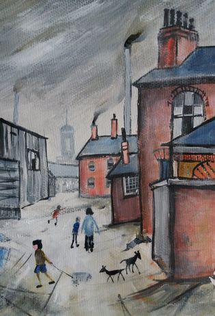 L S Lowry inspired acrylic painting L S Lowry inspired acrylic painting Autumn is here. There has been a noticeable change in temperature over the past few days, but the sun continues to shine and there are some remarkable sunsets to cheer us all up. This Friday, in my Art of the Landscape class at The Letchworth settlement, I will be taking the students through the painting of a sunset scene inspired by the work of Claude Lorrain, the French Baroque painter. It may seem a tall order to complete in 2 hours, but it’s all about the preparation…and simplification! I’m always amazed, wherever I see work at group exhibitions or critique evenings, to see the variety of styles and techniques on display. You can often pick out some threads of homage to more well- known artists, or an obsessive commitment to a genre. As a professional artist, it’s good to develop your ‘signature style’, one that is uniquely you and unmistakable, should anyone wish to pick you out in the vast art market place. Often, this is what we are told is required for any buyer, or agent, to invest in our work. Truth is, though, that the greatest artists of any age have changed their style constantly – developing and adapting to produce something new, to stay ahead of the crowd, to stay relevant, or dare I say it, fashionable?! Whilst it is nice to steadily plod on and stay within your own comfort zone, it is sometimes good to peer over the fence and try something different. That's why, in my Friday Landscape Class, I take a class my aim is to tackle a variety of landscape scenarios – seascapes, townscapes, trees, mountains, lakes, etc. However, I try and mix it up, with each work produced in a different medium every week. Acrylic, watercolour, pastel – each poses a different challenge and begins to push students who only like to stick with their favourite. I also introduce an element of art history, and every couple of weeks, we attempt to produce a work which either mimics the style of a famous artist (with a local scene) or copies a painting faithfully but using an alternative medium. For two hours you are transported into that artist’s mind using shapes and methods of application perhaps entirely alien to your usual hand. It can be exciting, sometimes annoying, often surprisingly difficult but ultimately rewarding. Students throughout history have copied the Old Masters to learn technique, it isn’t something new. In my version, I don’t just stick to the classics though – any style, any ‘ism’ is up for grabs, so long as it can be broken down and painted in about 2 hours. So, I urge you to have a go! Pick a van Gogh, or a Monet, or an O’Keefe. Grab your paints or pastels, have a think about how they may have produced their painting -and try it out. It may or may not work – but at least you might learn something along the way. It might loosen you up, give you an idea, or just make you appreciate the artist and their talent more. It will certainly give your brain a holiday, free you up from your own style and I guarantee, you’ll enjoy it! 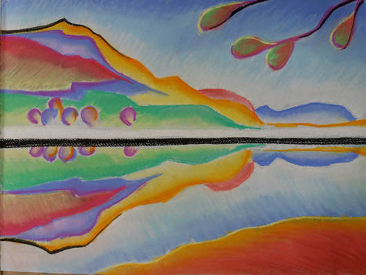 Georgia O' Keefe inspired pastel Even though I left school 30 years ago, I still feel a proxy tinge of sadness that summer holidays are at an end and the new school term is beginning. We had a great summer overall - no one could complain about the weather (or rather they did, but it felt good to moan that it was too hot for a change!); the BBQ made more appearances than it had done in the last three years and we spent the last week in beautiful Portugal, soaking up more sun, seafood and culture. Over here, I managed to catch a few more 'blockbuster' exhibitions. The BP portrait award was, as always, full of well executed and sensitive artworks - and as usual, I didn't agree on most of the awardees, apart from An Angel At My Table, by Miriam Escofet which deserved to be overall winner as it was beautiful. I also managed to catch the Summer Show at the RA. As an extravaganza of colour and variety it ticked all the boxes and Grayson Perry did an excellent job as curator. 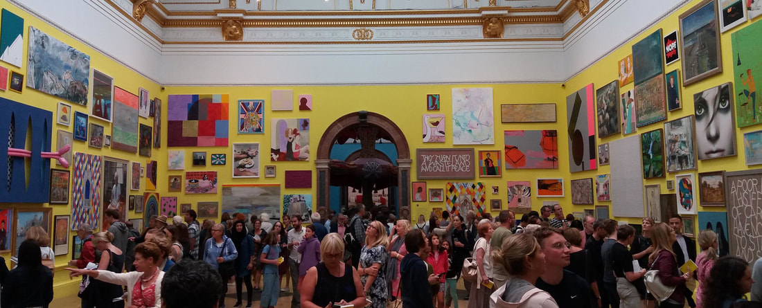 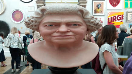 I did think, though, that it was just too political and cliched and it was harder this year to pick out any outstanding pieces. There were several Kim Jong- Uns, Trump and a prostitute, Nigel Farage and a Banksy Brexit poster. Subtle, this show was not. I liked the Queen's portrait with her elongated head and the massive drawing of Steven Hawking and a nun, but really, I got the overriding impression that the show was to be seen as a confusing whole, and not as individual artworks - hence Perry's bold room colour schemes.  I was lucky enough to get into the Artist Magazine's exhibition at Patchings Art Centre for the second year running and it was nice to pop up there for the Patchings Festival in July. It was a fabulous mix of exhibitions, demonstrators and art materials plonked on a field with big marquees and a brass band. It was all very inspiring and, dare I say, compared to the RA, very traditional and British... Anyway, the new school term has begun - and so too it has for me. This coming week sees me leading a new series of landscape classes at The Letchworth Settlement and on Thursday 13th, I'll be holding the first of two workshops at Harpenden Arts Club. Onward! 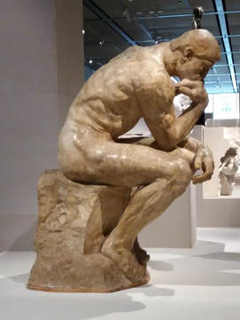 The Thinker by Auguste Rodin The Thinker by Auguste Rodin Though it’s not officially summer yet, I’ve recently seen quite a few ‘summer blockbusters’. ‘Solo’ and Jurassic World’ of course (!) but also some of the big art exhibitions around London – Rodin at the British museum, Picasso at Tate Modern and ‘All Too Human’ (Freud and Bacon) at Tate Britain. I found them all interesting, largely enjoyable and managed to see them without the usual teeming crowds. The only gripe was the cost – each one tipped the £20 mark. Were they worth the money? Here’s how they shaped up for me. Rodin and the Art of Ancient Greece: Taking up the large new extension at the British Museum, Rodin’s sculptural work is spread over an open plan space, through which you can glimpse tantalising views of what is to come. His work is complimented by Classical Greek art from the Museum archive, namely the Parthenon ‘Elgin’ marbles, which Rodin visited many times at the Museum. To see these ancient pieces in a different context together with Rodin’s sketches, subsequent maquettes of new interpretations and finished pieces is inspirational. I would have liked there to be more of a journey – surprises around the corner, rather than seeing everything in one go. That said, the sculptures are large and need the space to step back and admire them. You can see where the money has gone. Transport and positioning alone must have been costly. Overall, well presented and worth the money. 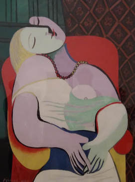 The Dream by Pablo Picasso The Dream by Pablo Picasso Picasso 1932: It is an imaginative idea – to present a year in the life of one of our greatest artists; a turning point in love and career. Picasso was in danger of becoming a ‘has been’. Despite his earlier successes, he was looking to try something new. He experimented in different styles, different mediums and with a different woman. At 50 years old, he found a new muse in the shape of 22-year-old Marie–Thérèse Walter. His portraits of Walter begin to contort into strange, sexually suggestive shapes of vivid colour which we are familiar with today, but at the time were revolutionary. I have to say though, that a couple of rooms on this theme would have been enough. There was not enough variety of image (which I suppose was the point), with too many rough sketches and discarded ideas and the story eked out till it was paper thin. It may have taken a while to pull all these pieces together – especially a series of paintings done within a week of each other. I can’t say that it was worth the cost of admission – but if you are an ardent fan of Picasso, maybe. 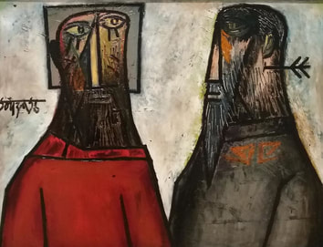 Jesus and Pilatus by F N Souza Jesus and Pilatus by F N Souza All Too Human: This exhibition at Tate Britain grouped a series of figurative paintings together under the mantle of influential London- based artists from the early 20th Century to the present. The two main painters being Francis Bacon and Lucian Freud. There is an interesting chronology and it is great to see how Bacon and Freud were influenced by earlier artists such as Sickert and Spencer. There was a mixture of portraits and landscapes with F N Souza’s illustrative imagery, colourful and iconic, standing out as a highlight. Then there were the last two rooms. Suddenly, we are in a different exhibition altogether. Without an explanatory introduction, there is a room dedicated to Paula Rego and a final room of female portrait artists. It seems like a guilty add on for the ‘Me Too’ generation. The art is great, some arguably better than that which came before – but it is out of context, and jars. The curators should have introduced female artists alongside Bacon et al, even if we had not heard of them, to show the state of play at that time. Then, when the latter two rooms appear (together with some contemporary male artists such as Jonathan Yeo) we could see that female artists are now more widely recognised and stand shoulder to shoulder, as it were – then there would be a natural flow to the story. There were lots of works to be seen and a good variety. It is hard to say what were already in the Tate archive and which had to be brought in. Worth the money? Not sure again. It seems wrong to be talking about whether an art exhibition is ‘worth the money’. You could argue that art is educational, that it allows the public access to world- class artworks and enriches life and how could you put a price on it? On the other hand, not everyone can afford £20 per head for an hour-long experience. You could spend a whole day at a stately home and see hundreds of pieces of art and architecture for that. If art is to be accessible for all, then the cost needs to come down. I can see the point. It costs a lot of money to put on a show, and most of the larger museums and galleries are free entry to the public, so they need to pay for them somehow. To be honest, in most cases, I’d rather just pop into the National for free and have a browse around their permanent collection for half an hour, than spend a fortune being jostled in a ‘blockbuster’ show. As a compromise, perhaps the answer is to begin charging a small entry fee to the permanent collections and heavily reduce the price of the shows? 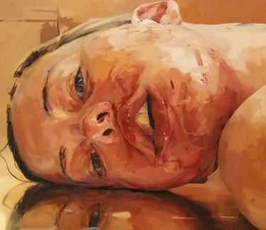 Reverse by Jenny Saville
This is probably also due to my chosen subject matter. This year marks the 200th anniversary of the birth of Emily Bronte and as a longtime admirer I've decided to mark the occasion with a series of celebratory works. I've had many ideas, some figurative, others more conceptual. Unfortunately I've begun to 'overthink' the subject as I try to do it justice. Perhaps that is the problem...Yoda says, "Do, or do not. There is no try". Time to get on with it!  'Jane Lost On The Moor'
acrylic on canvas 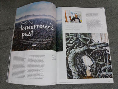 It has been a great start to the year! A mad rush of events in the early stages of January meant that 2018 started with a bang, but as February approaches things have calmed down and now is a time to contemplate the rest of the year - take stock, as it were. This month I am featured in the February edition of Hertfordshire Life magazine! It's a nice glossy four page spread and it really shows my work off well. The interview came out of the blue last October and I'm hoping that it is just a taster for things to come! It was an interesting experience and my eclectic background and methods came across well, though inevitably I suppose, there were a few mistakes - facts lost in translation! I would like to say here and now that I haven't worked on the Indiana Jones films (sadly)! I'm now preparing for week 4 of my 'Art of the Landscape' course at The Letchworth Settlement. This term we are taking a tour of the world and painting a variety of exotic scenes in different mediums. This week will be a view in Southern France in the style of Cezanne and painted in acrylics. Please contact The Settlement should you wish to take part next term. 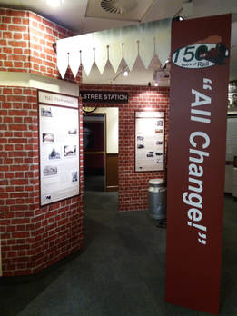 I've recently completed a museum exhibition wearing my other 'hat' of designer. "All Change! 150 Years of Rail at Elstree & Borehamwood" opened last Monday and runs until 26th July. I spent 6 months working with the excellent museum volunteers and various contributers on the exhibition and I do hope you can pop along to Elstree & Borehamwood Museum to see it.
|